

WHY OUR RESPONSIVE WEB DESIGN SOLUTIONS?
There has been a paradigm shift in the browsing habit of individuals on the internet due to the advent of high end and smart mobile devices which has prompted businesses to look for quality responsive design or mobile friendly website design which is purely ‘dynamic’ in nature. Statistics reveal that by the end of 2016, mobile responsive websites is poised to overtake static websites in a big way. This has prompted clients to ask for the most professional responsive design for their websites which goes on to support varied screen size and screen resolutions. It means that your website design would be perfectly compatible to desktops, laptops as well as mobile devices and that would eventually help to garner more online visitors or potential customers.
TOP 3 REASONS WHY YOU NEED TO HAVE A RESPONSIVE WEB DESIGN

Google loves responsive website

Responsive design are more sustainable

Mobile devices are the future of internet
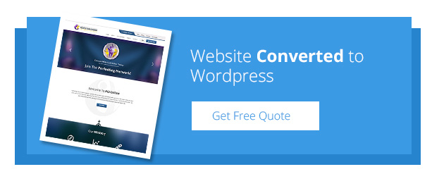
Responsive Design Portfolios
View our exclusive web design portfolios that we have showcased which provides a clear idea of our web design and development skills that we have mastered over the years.
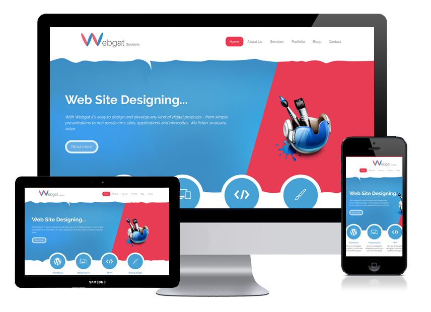
WE TAKE CARE OF VARIED SCREEN RESOLUTIONS
Screen resolution is one of the most vital elements of website design which needs to be kept in mind while designing a highly responsive website. Conventionally or traditionally, a web page or a website is built exclusively for desktops but when the same website is seen on a mobile device, the alignment and resolution seems to alter or differ. This is where a responsive website design comes into play as companies exclusively look for such high end responsive web design when it comes to giving shape and functionality to a professional business portal with all the basic elements and features kept intact. Responsive design actually refers to a web page which can adjust itself accordingly to different screen size, resolutions and across multiple devices,be it desktops,laptops, tablets, iPads and all types of smart phones.
OUR EXPERT TEAM OF
RESPONSIVE DESIGNERS
Get a first hand experience of our professional services as our web design India specialists make every effort to satisfy your specific design needs by creating stunning looking bespoke business portals that is compatible on all thought about mobile and web platforms. We have a vast pool of talent that goes on to create magic on the web and it is our versatile responsive design team which makes a complex project look simple through their vast experience in design & development. Skills that are beyond comparison is nurtured and developed here at Website Design Company India and our activities truly reflect that.
Activities that are a part of our day-to-day design & development work:

Business Goal Analysis

Wireframe Design & Prototyping

Information Architecture design

Usability Testing

Expert Evaluation
CONVERTING MOBILE AUDIENCE THROUGH
A RESPONSIVE WEBSITE DESIGN
Your business is bound to leap forward through a forward thinking website that is designed keeping in mind the essence of mobile responsiveness/mobile friendliness. This is where you can strikeGold. As more and more individuals are on their smart phones searching for their products, services, goods and wares online, the chances of finding your business/company increases if your website is perfectly “mobile responsive” and in sync with the latest web design trends. Call us now and we help you with a smart online business idea that is rich in creativity and innovation.


Call Us
+91 9725750782


About Company
Webgat is the premier web design and web development agency in India specializing in creating dynamic websites on diverse platforms and environment.
Our Services
Web Design
We are a force to reckon in the area of dynamic web design in India. Our experienced website designers are skilled to the job, tailoring bespoke design solutions for clients, 365 days a year.
Web Development
As the premier web development company, we specialize in website development, mobile application development and web application development in India through our dedicated team of web..
© 2026 Webgat Solutions